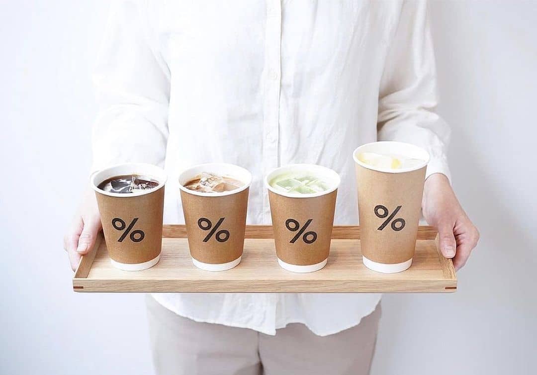
There’s a high chance that you’ve seen (or been to) % Arabica before.
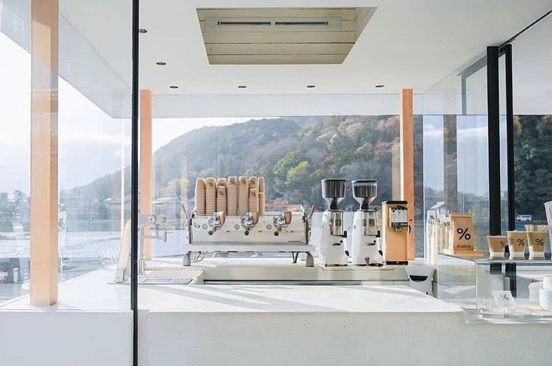
Founded in Kyoto, Japan, by Kenneth Shoji in 2013, this coffee chain has taken the world by storm, with 186 stores globally.
But something is fascinating behind % Arabica’s sleek logo, and it’s not what you think.
If you’re like most people, you might have thought it was simply the percentage mark and fits with the minimalistic design that became trendy.

Or thought the “%” symbol was about coffee bean ratios or some secret recipe.
Some people even called the brand “Percentage Arabica”.
Well, that is actually far from the truth and it shocked us when we were told the real meaning behind the logo.
The logo’s origin story is as unique as the brand itself.
Kenneth Shoji, the visionary founder, shared an enlightening moment that sparked the birth of the iconic symbol.
“One night, I was looking for a logo for the brand. I was always impressed with the * logo of @wallpapermag as they can type the logo with any keyboard.
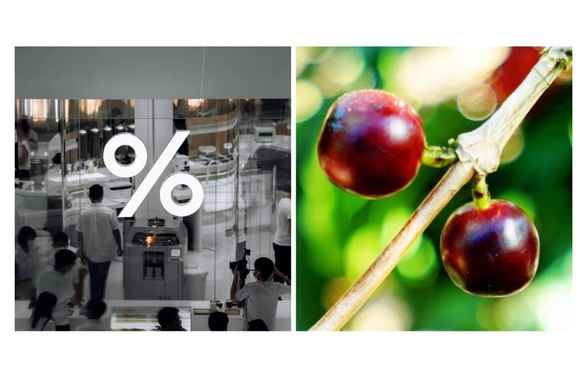
Then I started looking at my laptop keyboard, and my eyes and heart stopped at the % mark, which looked to me like coffee cherries on a branch.

At the moment, I told myself that I should make a global coffee brand with this, and I’ve been working nonstop ever since.” Kenneth Shoji – Founder of % Arabica
Now, when you picture how coffee cherries dangle from their branches, the logo’s essence begins to unfold.
It’s a symbol that perfectly marries the brand’s philosophy with the natural beauty of coffee.
With stores now in 24 countries, % Arabica’s dream is to let us “See the World Through Coffee.”
Their message is clear: life is an adventure worth exploring, with a coffee cup in hand.

And the brand has also confirmed that they are simply just named “Arabica”.
So, next time you’re enjoying a brew from Arabica, remember, it’s not just a percentage mark you’re holding; it’s a symbol of passion, dreams, and the beauty of coffee cherries.
And here’s a fun idea: ask your friends if they know the shocking story behind % Arabica’s logo.

